
Page 24 - 161 varsity ebook
P. 24
22 / Lifestyle
He and his teammates realised that
there was a problem of lacking a font
for eye-catching titles for media con-
tent like YouTube video thumbnails
years ago, and they wanted to solve
this problem with a new font design.
“Our team did some research on
market demand for font design which
is used for eye-catching titles. We
also asked whether people would like
to pay for our design in the research,”
he says.
After the research, the team devel-
oped Moodmen Reborn Font(思
緒重生體), a font design with bold
and angular strokes, in 2020.
With the new design, the team
believes that this can help promote
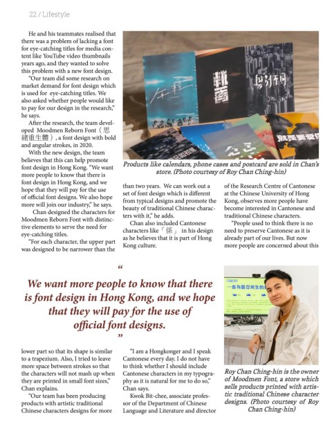
font design in Hong Kong. “We want Products like calendars, phone cases and postcard are sold in Chan’s
more people to know that there is store. (Photo courtesy of Roy Chan Ching-hin)
font design in Hong Kong, and we than two years. We can work out a of the Research Centre of Cantonese
hope that they will pay for the use set of font design which is different at the Chinese University of Hong
of official font designs. We also hope from typical designs and promote the Kong, observes more people have
more will join our industry,” he says. beauty of traditional Chinese charac- become interested in Cantonese and
Chan designed the characters for ters with it,” he adds. traditional Chinese characters.
Moodmen Reborn Font with distinc- Chan also included Cantonese “People used to think there is no
tive elements to serve the need for characters like「係」 in his design need to preserve Cantonese as it is
eye-catching titles. as he believes that it is part of Hong already part of our lives. But now
“For each character, the upper part Kong culture. more people are concerned about this
was designed to be narrower than the
“
We want more people to know that there
is font design in Hong Kong, and we hope
that they will pay for the use of
official font designs.
”
lower part so that its shape is similar “I am a Hongkonger and I speak
to a trapezium. Also, I tried to leave Cantonese every day. I do not have
more space between strokes so that to think whether I should include
the characters will not mash up when Cantonese characters in my typogra- Roy Chan Ching-hin is the owner
they are printed in small font sizes,” phy as it is natural for me to do so,” of Moodmen Font, a store which
Chan explains. Chan says. sells products printed with artis-
“Our team has been producing Kwok Bit-chee, associate profes- tic traditional Chinese character
products with artistic traditional sor of the Department of Chinese designs. (Photo courtesy of Roy
Chinese characters designs for more Language and Literature and director Chan Ching-hin)